If you've ever wondered why a "1 inch" mark on a website ruler doesn't match a real ruler held up to the same screen, the answer comes down to one spec buried in your display's hardware: PPI.
PPI, Defined Simply
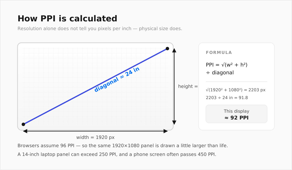
PPI stands for pixels per inch — the number of physical pixels packed into one linear inch of a display. It's calculated from three numbers your screen already has: its horizontal resolution, vertical resolution, and physical diagonal size.
The formula looks like this:
PPI = √(width² + height²) ÷ diagonal inches
A screen with more pixels crammed into the same physical size has a higher PPI. A screen with fewer pixels spread across a larger physical size has a lower PPI.
Why This Number Matters for On-Screen Measurement
Web browsers were built around a fixed assumption: 96 pixels equal one inch, regardless of the actual screen. That assumption dates back to early desktop monitors and was never perfectly accurate — but today it is often wildly wrong:
- A standard 24-inch, 1920×1080 desktop monitor sits close to 93 PPI — reasonably near the 96 PPI assumption, so the error is small.
- A 14-inch laptop with a sharp, high-resolution panel can exceed 250 PPI — more than double the browser's assumption.
- A modern smartphone display commonly runs 450–500+ PPI — four to five times higher than what the browser assumes.
If a ruler tool just draws "96 pixels = 1 inch" without checking your real PPI, the error scales directly with how far your screen's actual PPI sits from that number. On a high-PPI laptop or phone, an uncalibrated on-screen inch can be less than half its true physical length.
How Calibration Fixes This
Calibration replaces the generic 96 PPI assumption with your screen's real PPI, using one of a few methods:
- Auto-detection, which reads your resolution, aspect ratio, and device pixel ratio and checks them against a hardware database.
- Manual entry of your screen's diagonal size, letting the tool calculate PPI directly from the formula above.
- Matching a physical object of known size — most reliably a standard credit or ID card, manufactured worldwide to a fixed 85.60 × 53.98 mm size — against an on-screen outline.
RulerGo supports all three approaches, plus a device-specific database lookup, so you can pick whichever method matches what you already know about your screen.
A Quick Way to Check If Your Current Setup Is Off
Hold a credit card up to your screen at 100% browser zoom next to a ruler graphic that claims to be showing true size. If the card's real edge doesn't line up with the "3.37 inch" mark (the card's short edge is 85.60 mm, or 3.37 in, wide), your current tool isn't calibrated — and depending on your screen, that gap could be small or substantial.
FAQ
Is PPI the same as screen resolution?
No. Resolution is the raw pixel count (e.g., 1920×1080). PPI factors in the physical screen size too, so two screens with identical resolution but different diagonal sizes will have different PPI values.
Does PPI affect anything besides on-screen rulers?
Yes — it's also why the same UI design can look sharp on one device and slightly different in physical size on another, and it's a factor in print resolution planning (print PPI/DPI requirements differ from screen PPI).
Can I find my screen's PPI without calculating it manually?
Yes — a tool with auto-detection or a device database lookup, like RulerGo, calculates it for you, and you can double check with the diagonal-size formula if you know your screen's size.
Why don't all "online ruler" tools calibrate for PPI?
Building accurate PPI calibration takes more engineering than just drawing tick marks at a fixed pixel interval, so many simpler tools skip it entirely and default to the inaccurate 96 PPI assumption.